|
Matrix Report
Introduction
A matrix
report is a chart with two axes (rows and
columns) that display for sets of data. On
the rows, the report displays one set of
data, while on the columns the report
displays another set. Within the two axes,
report displays a cross-product of results.
Hands-on
You client
needs to get the summary report of their
customers shares owned. They like to have
the output format be the same as spreadsheet
format. You are assigned to create a grid
style of data output as a spreadsheet, with
rows that present customers name and columns
that present stock�s symbol. The
intersection of these two entities is a cell
that shows the number of shares that
customer has on that stock.
This report
should show the number of shares of stock�s
holders by each customer in each of the
stocks. Make sure the cell format mask is
NNN,NN0. You should use the customer and
portfolio table, and put grid around each
number of shares for easy reading. You
should also get the totals for each column
and row.
They want you
to change the cell color to red if its value
is greater than 2000 and do the same for
rows and columns sub-total.
See Figure 4.
Your tasks
are:
1- Create a
matrix report.
2- Put grid
around each cell.
3- Use user
layout format mask for cells and sub-totals
as NNN,NN0.
4- Calculate
the subtotal for rows and columns.
5- Highlight
the cells with any color (ex: red) if their
values are significant.
6- Highlight
the sub-total cells with any color (ex:
pink) if their values are significant.
7- Apply
template to the report.
8- Run the
report.
9- Test the
repot.
You will learn how to: use query builder,
set table relationship, change properties
from property palette, use report style
matrix, make subtotal for rows and columns,
use the �select parent frame� icon, create
grid, use the conditional formatting.
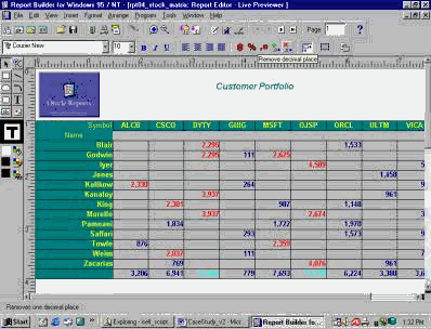
Figure 4
Create a new
report
In the Object
Navigator, highlight the Reports item, and
click on the "create" icon (Green �+�) to
create a new report.
Build a new
report Manually
In the New
Report window, choose the �Build a new
report manually� option, and click �OK.�
Create a SQL
box
In the �Data
Model,� click on the SQL icon on the
vertical toolbar. Drag the �+� sign in to
the Data Model and click any where that you
wish to have your object.
In the �SQL
Query Statement� box, write a SQL statement
to query all customers with their stocks�
symbol and number of shares owned.
(SQL Query
Statement)
SELECT
last_name, stock_symbol, shares_owned
FROM portfolio
WHERE ( id =
customer_id)
Then click
�OK.�
Change a SQL
box�s property
In the Data
Model window, right click on the SQL box
(Q_1) and open the property palette option.
In the
Property Palette window, change the name to
Q_PORTFOLIO. Then close the window.
Report Wizard
In the Data
Model window, on the toolbar, select the
Report Wizard icon.
Matrix Report
A matrix
report is a chart with two axes (rows and
columns) that display for sets of data. On
the rows, the report displays one set of
data, while on the columns the report
displays another set. Within the two axes,
report displays a cross-product of results.
Style, Data,
Rows, Columns, Cell, Totals, and Template
tabs
In the Style
tab in the Report Wizard, choose the report
style as Matrix with a title of �Customer
Portfolio.� Then click on the �Next� icon.
In the Data
tab, select the data that you will use in
your report. You should have already had
that SQL statement. Don�t change anything
and click Next.
In the Rows
tab, select LAST_name as a "Matrix Row
Field" and click Next.
In the Columns
tab, use �Stock_symbol� as a "Matrix Column
Field" and click Next.
In the Cell
tab, select the sum of the shares_owned as a
"Matrix Cell Fields" and click Next.
In the Totals
tab, to make subtotals for rows and columns,
select SumShares_OWNED to calculate the sum
of rows or columns {Sum(SumShares_OWNED)}.
Then click Next.
In the Labels
tab, delete the label for the sum of the
shares owned, change Last_name to name,
change stock_symbol to symbol, and then
click Next.
In the
Template tab, use �Cyan Grid� template
report and click �Finish.�
Navigate
through a report
Now, you
created a customers portfolio report.
Navigate through the report.
Layout Report
Editor
Use the layout
report editor to change the report layout.
Layout Model
Click on the
�Layout Model� icon on the top of the
horizontal toolbar.
In the Layout
Model window, you can change the size of
each item. Use the "select parent frame"
icon to go to the parent's column and resize
it. When finished resizing, click on the
�run� icon to run the report.
Live
Pre-viewer
In the Live
Pre-viewer, select the name item and then
change its alignment to left or right. You
can also right click on it, open its
property palette, and change its alignment.
Change
appearance of a report
Select the
cells and change their alignment and format
mask. Do the same for the columns'
subtotals.
Navigate
through the report.
Conditional
Formatting
In the Live
Pre-viewer, right click on the cells, and
open the "Conditional Formatting" option.
In the
Conditional Formatting window, you can
define exceptions to highlight data for
specified conditions with different
formatting such as color.
In the
Conditional Formatting window, click �New�
and In the Format Exception window, change
the shares owned value to red if it is
greater than or equal 2000.
SHARES_OWNED
>= 2000
Click �OK.�
Check the
report.
Go to the last
page, change the alignment and mask format
for the row's subtotals; and change the
color if their values are more than 7,000.
Go to the
first page.
Do the same
for the columns' subtotal; and change the
color if their values are more than 10,000.
After testing
the report output, highlight the report and
save it as report number 4 in folder
(REPT04).
Questions:
Q: What is a
Matrix Report?
Q: How do you
set a table relationship in the report
builder?
Q: How do you
change an object using its properties
palette?
Q: How can you
make a sub-total for rows and columns in a
matrix report?
Q: What does
the Select Parent Frame icon?
Q: What is a
conditional formatting in the report
builder?
Q: You client
needs to get the summary report of their
customers shares owned. They like to have
the output format be the same as spreadsheet
format. You are assigned to create a grid
style of data output as a spreadsheet, with
rows that present customers name and columns
that present stock�s symbol. The
intersection of these two entities is a cell
that shows the number of shares that
customer has on that stock.
This report
should show the number of shares of stock�s
holders by each customer in each of the
stocks. Make sure the cell format mask is
NNN,NN0. You should use the customer and
portfolio table, and put grid around each
number of shares for easy reading. You
should also get the totals for each column
and row.
They want you
to change the cell color to red if its value
is greater than 2000 and do the same for
rows and columns sub-total.
See Figure 4.
Your tasks
are:
1- Create a
matrix report.
2- Put grid
around each cell.
3- Use user
layout format mask for cells and sub-totals
as NNN,NN0.
4- Calculate
the subtotal for rows and columns.
5- Highlight
the cells with any color (ex: red) if their
values are significant.
6- Highlight
the sub-total cells with any color (ex:
pink) if their values are significant.
7- Apply
template to the report.
8- Run the
report.
9- Test the
report. |